
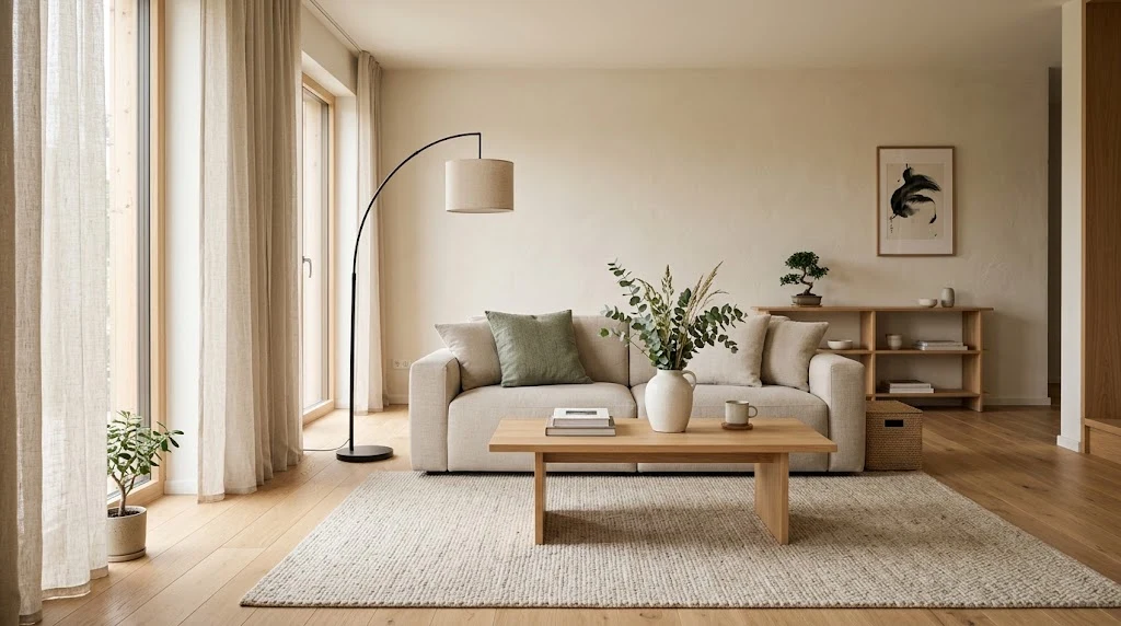
The Japandi color palette blends warm neutrals like off-white, sand, and greige with earthy woods, muted greens, and soft black accents. Colors stay low in saturation and come from nature. Use a 60-30-10 split: mostly neutrals, some wood or earth tones, and a small touch of dark contrast.
Walk into a Japandi room and you feel your shoulders drop. Nothing shouts. The walls are soft, the wood looks warm, and one dark piece anchors the space. That calm feeling comes mostly from color.
Japandi mixes Japanese minimalism with Scandinavian coziness. Both styles value simple living, natural materials, and rooms that work for the people in them. The palette reflects that. In this guide, you’ll learn which colors to pick, where to use them, and which mistakes to skip.
What Makes the Japandi Color Palette Different
Japandi colors come from nature. Think sand, stone, clay, moss, bark, and charcoal. Designers describe these shades as muted and earthy rather than bright, and the palette leans on neutrals with small hits of color from greenery and decor.
Two ideas shape every choice. The Japanese side brings restraint and a love of simple, quiet spaces. The Scandinavian side brings warmth and light, which helps rooms feel friendly during long, dim winters.
Put those together and you get a palette with soft contrast. You won’t see stark white next to neon anything. Instead, you’ll see off-white next to oak, linen next to stone, and a slim black frame against a pale wall. Your eye moves slowly through the room, and that is the goal.
Warm Neutrals: Your Base Colors
Neutrals do most of the work in a Japandi home. They cover your walls, ceilings, and large furniture pieces. Pick shades with a warm undertone so the room feels soft instead of cold.
Good base colors include warm white, cream, oatmeal, sand, and light greige. Benjamin Moore’s White Dove is a popular warm white for this look, and many Japandi guides list a similar shade near #F5F0EB. You don’t need that exact paint. You need a white with a touch of yellow or beige in it.
Skip pure, bright white on large walls. It can look harsh and show every shadow. If your room gets little daylight, go a shade warmer. If it gets strong sun, a slightly cooler cream keeps things fresh.
One more tip: test paint samples on two walls and watch them for a full day. Morning light and evening light change the same color a lot.
Earth Tones and Wood: Add Warmth

Once your base is set, bring in earth tones. These cover soft browns, tan, taupe, clay, and warm terracotta in small amounts. Brown works best when you use it with care. It often shows up in textiles, vases, and ceramic bowls, and it can add a cozy, wrapped-in feeling to a dining room or reading corner.
Wood is the star here. Light woods like ash, birch, and white oak fit the Scandinavian side. Darker woods like walnut and ash stained deep brown fit the Japanese side. Many Japandi rooms use both, which gives the space depth without adding another color.
Keep the wood tones consistent. If your floor is pale oak, choose a coffee table in a similar or slightly darker shade. Three or four wood tones in one room can feel messy. Two feels intentional.
Natural fibers help too. Rattan, jute, and bamboo all add texture and sit well with the same earthy colors.
Muted Greens: The Main Accent

Beyond neutrals, green is the most common color in Japandi homes. It makes sense. Green connects the room to the outdoors, and that fits the style’s focus on nature.
Stay with soft, grayed-out greens. Sage, moss, olive, and eucalyptus all work. A sage wall looks lovely next to pale wood furniture and a single plant. Forest green works well on a front door or a kitchen island because it reads deeper without feeling loud.
You can also get your green from living things. A bonsai, a pothos on a shelf, or a few branches in a tall vase add color with zero paint. Plants also change through the seasons, so your room never looks frozen.
Avoid bright lime or minty greens. They pull attention away from the quiet mood you’re building.
Soft Black and Charcoal: Add Contrast

Japandi isn’t all pale. Dark shades give the room structure. Without them, an all-beige space can look flat.
Use black, charcoal, deep gray, or indigo in small doses. Good spots include picture frames, lamp bases, window trim, cabinet hardware, black faucets, and interior doors. In a kitchen, black taps against pale timber cabinets look clean and modern. In a bathroom, black fixtures next to wood panels give a spa feel right away.
Pick soft black over harsh jet black when you can. Charcoal and off-black look gentler against warm walls. Also keep dark pieces spread out. Place one near the door, one by the window, and one on a table, so the contrast feels balanced across the room.
How to Use the 60-30-10 Rule

Designers often use a simple split to keep a palette from getting crowded. In Japandi, it works like this:
- 60% base colors: warm white, cream, or sand on walls, ceilings, and large rugs.
- 30% secondary colors: wood tones, taupe, and soft brown on furniture and textiles.
- 10% accents: muted green and black in decor, plants, and small details.
This ratio protects the calm feel. Your eye has plenty of quiet space to rest on, and a few small points to look at.
You can bend the numbers a little. A bedroom might run 70-25-5 for extra quiet. A home office might go 55-30-15 to feel a bit more focused. Just keep the accents small. If you ever feel a room is “too much,” remove one accent color before adding anything new.
Japandi Colors Room by Room

Each room has its own job, so each can use the palette a little differently.
Living room. Start with warm white or greige walls. Add a linen sofa in oat or stone, a wood coffee table, and one sage cushion. Finish with a black floor lamp or a dark ceramic vase. Keep the rug neutral, with a simple weave or subtle pattern.
Bedroom. This room should feel the quietest. Use soft sand or pale gray-beige on the walls. Choose bedding in cream, oatmeal, or light taupe, and add one darker throw in charcoal or brown. A low wooden bed frame helps the room feel grounded. Keep nightstand decor to two or three items.
Kitchen. A white kitchen with natural wood accents is a Japandi staple. Pale timber cabinets, off-white walls, and black hardware work well together. If you want color, paint the island in muted green or add a green herb planter on the counter.
Bathroom. Gray and white work well here, along with soft stone shades. Add wooden stools, bamboo trays, and black tapware. Towels in sand or light gray keep the space simple. A single plant, like a fern, adds life if your light allows it.
Home office. Pair warm neutral walls with a wood desk and a charcoal chair. Add one muted green plant. This mix keeps the room focused without feeling cold.
Texture Does the Work of Color
Because Japandi colors stay quiet, texture adds the interest. Two pieces in the same shade can look totally different when one is smooth ceramic and the other is nubby wool.
Linen is the go-to fabric. It looks relaxed, and it often comes in natural or garment-dyed shades like oat, stone, and sage. Cotton, wool, and boucle also work. Pair them with matte ceramics, stone surfaces, and raw wood.
Handmade items fit the style well. A hand-thrown bowl with a slightly uneven glaze adds more character than a mass-produced one. Japanese design has a long tradition of valuing small imperfections, and you can use that idea at home. Look for matte finishes over glossy ones, since shine can bounce light around and break the calm.
If your palette feels flat, don’t add a new color. Add a new texture instead.
Lighting Changes How Your Colors Look
Even a perfect palette can look wrong in poor light. Paint reads differently under daylight, warm bulbs, and cool bulbs.
Choose warm white bulbs, usually around 2700K to 3000K. They keep neutrals soft and wood tones rich. Avoid bright, cool bulbs in living spaces because they make beige look gray and wood look dull.
Use several light sources in each room. A ceiling light, a table lamp, and a floor lamp create gentle pools of light instead of one harsh glare. Paper lanterns, linen shades, and frosted glass all spread light softly. These shades fit the style and keep shadows gentle.
Natural light matters most. Keep window treatments simple. Sheer linen curtains in white or cream let daylight in while still giving privacy.
Common Mistakes to Avoid
Most Japandi color problems come from adding too much. Watch for these:
- Bright, saturated colors in large amounts. A bold yellow cushion can break the calm. If you love color, choose a muted version.
- Too many accent colors. More than two accents in one room starts to feel busy. Edit until only the best remain.
- Cold white walls. They clash with warm wood and can make a room feel sterile.
- Ignoring undertones. A pink-beige sofa next to a yellow-beige wall looks off. Hold samples side by side before you buy.
- Skipping dark accents. All-pale rooms can feel flat. Add at least one soft black or charcoal piece.
- Using glossy finishes everywhere. Matte and natural finishes suit the style better.
Fixing these is usually cheap. Swap a cushion, change a bulb, or move a plant, and the room often improves right away.
Seasonal Tweaks That Keep the Palette Fresh
You don’t have to repaint to change the mood. Small swaps work well.
In spring and summer, lean lighter. Use white linen, pale wood, and fresh sage green. Open the curtains wide and add a few cut branches. The room feels airy and bright.
In fall and winter, add warmth. Bring in brown wool throws, rust-toned ceramics, and darker wood accents. Dunn-Edwards, a paint brand, has shown Japandi fall palettes built around neutral browns and soft mauves over a cloudy gray backdrop. You can borrow that idea with a single deep-toned pillow or a mauve vase.
Keep the base the same all year. Change only two or three small items each season. That way your home feels fresh without losing its quiet character.
Start Small and Build Slowly
You don’t need to redo your home in one weekend. Pick one room and begin with the walls or one large piece, such as a rug or sofa. Choose a warm neutral base. Add one wood piece, one green plant, and one dark accent. Then live with it for a week.
Notice how the room feels at different times of day. If it feels calm, you’re on track. If something stands out in a bad way, remove it. Japandi rewards patience and careful editing, and every item should earn its place.
The best Japandi color palette is the one that makes you feel relaxed when you walk through your door. Start with warm neutrals, add earthy tones and muted green, and finish with a touch of soft black. Your home will feel quieter, lighter, and easier to live in.


Comments are closed.